Internet Intelligence monitors your assets from vantage points around the world. We also provide insight into market reachability from your current set of CDN providers.
CDN AnalyticsThe CDN analytics view provides insight into service delivery to your customers from any of the following CDN providers: Akamai, Cachefly, CDN77, CDNetworks, Cloudflare, Cloudfront, Edgecast, Fastly, Highwinds, Level3, Limelight, and Maxcdn. When you first open CDN analytics, one of the CDN providers in your portfolio is selected by default. If you do not have any CDNs in your portfolio, the first CDN provider in the alphabetical list will be selected by default. The selected CDN’s latency is displayed in the Latency Map. In the Latency Comparison and Reachability Failure Rate graphs, the selected CDN’s data will appear in black. Data displayed in the three charts are determined by the drop-down menus at the top of the page. Change any or all of these settings to view the data you need. Note: Latency identifies the time required for a vantage point to get an answer from the asset. Reachability identifies whether or not the vantage point could reach the asset.

CDN Provider – A list of all CDN providers monitored within Internet Intelligence. Latency Metric – See the Latency Metric section for descriptions of each metric. Market – Select a continent, a sub-continent, or global, to display all world markets. NOTE: Chart data is limited to the geographic market selected. Time Range – View historical measurements for the most recent 1, 4, or 7 days. |
|
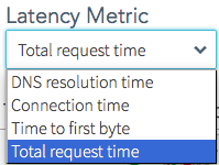
Latency MetricDNS Resolution Time: Time in milliseconds from the time the request was sent by the vantage point to the time the DNS reply was received. Connection Time: Time in milliseconds from the time the connection was started to the time the connection completed. Time to First Byte: Time in milliseconds from the time the connection completed to the time the first byte of data is received. Total Request Time: Full time duration in milliseconds of the request transmission through to the end of the received data. It is the sum total of the other four measurements plus any lag or waiting time during the process. |
 |
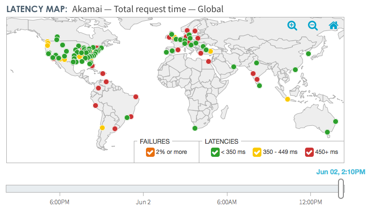
Latency MapDisplays latency measurements based on the Latency Metric chosen in the drop-down list, for the CDN locations based on the Market drop-down list. The slider, displayed below the Latency Map, is based on your Latency Metric selection as well as the Time Range selection. Slide the large white handle along the time range to show the CDN information in the Latency map, Latency comparison, and the Reachability Failure Rates. A flashing red-orange halo around a colored market city indicates that location has a failure rate of more than 2%. Uncheck any item in the legend at the bottom of the map to remove those items from view. |
|
 |
|
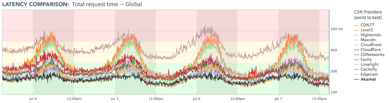
Latency ComparisonDisplays an interactive graph for all CDNs. Each CDN is color coded in the legend. When you select a CDN from the drop-down list, the CDN displays bold and black in the legend and on the graph. The graph data are the most recent 72 hours of performance latency in five minute increments. The data are the measured response time, as described by the chosen Latency Metric, for queries sent to each CDN Provider. The background colors in this chart indicate the same conditions as the red, yellow, and green colors on the Dashboard view; Operational (Green), Degraded Performance (Yellow), or Major Degradation (Red). The interactive graph supports the following behaviors:
|
|
 |
|
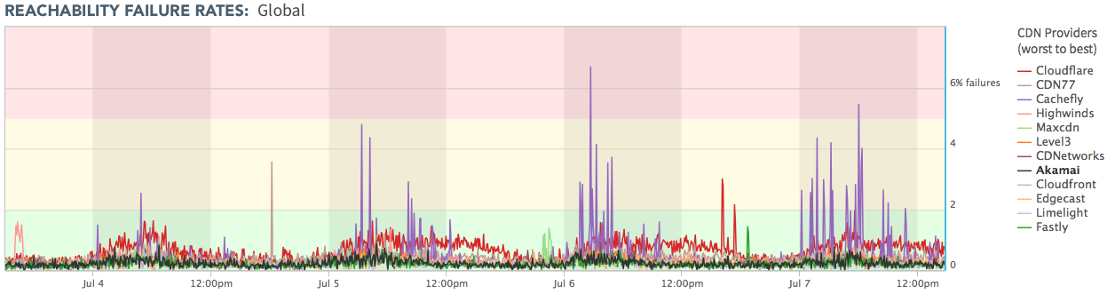
Reachability Failure RatesDisplays an interactive graph for all CDNs. Each CDN is color-coded in the legend. When you select a CDN from the drop-down list, that CDN displays bold and black in the legend and on the graph. The graph displays the measured percentage of failed queries in five minute intervals for the past 72 hours. A query fails when the query vantage point from the target market could not reach a CDN resource. Up to 2% of failed vantage point queries is acceptable. The background colors in this chart indicate the same conditions as the red, yellow, and green colors on the Dashboard view; Operational (Green), Degraded Performance (Yellow), or Major Degradation (Red). The interactive graph supports the following behaviors:
|
|
 |
|